

LaWenda / Client project / Under review
Four expressions of LaWenda
Four logo directions for a Polish podology and foot-care practice, bringing lavender, distinctive lettering and a calm natural palette together.
Brief
Explore a gentle, recognisable identity for LaWenda, connecting lavender with podology and foot care.
Our role
Logo exploration, colour variations and application concepts.
 01
Direction 01
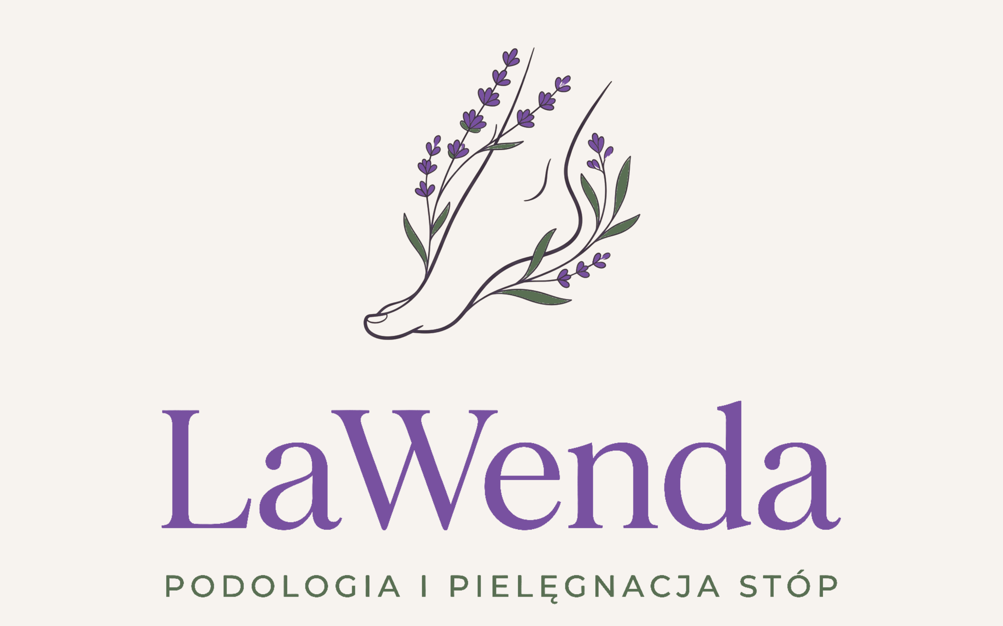
Foot and lavender
A delicate foot contour, flowering lavender and calm serif lettering.
Explore direction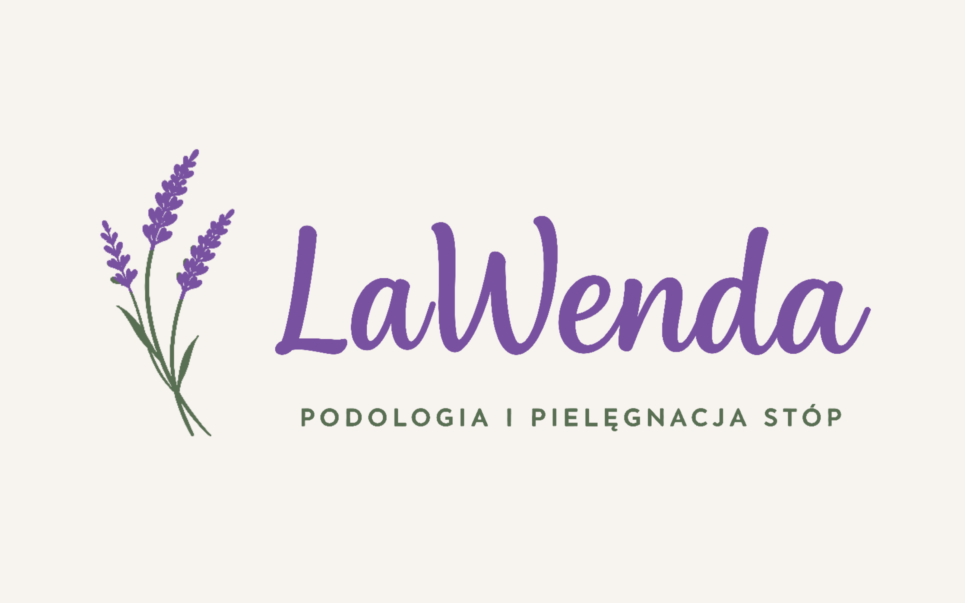 B-02
Direction 02
Rounded calligraphy
Straight strokes, a rounded W and three flowering sprigs.
Explore direction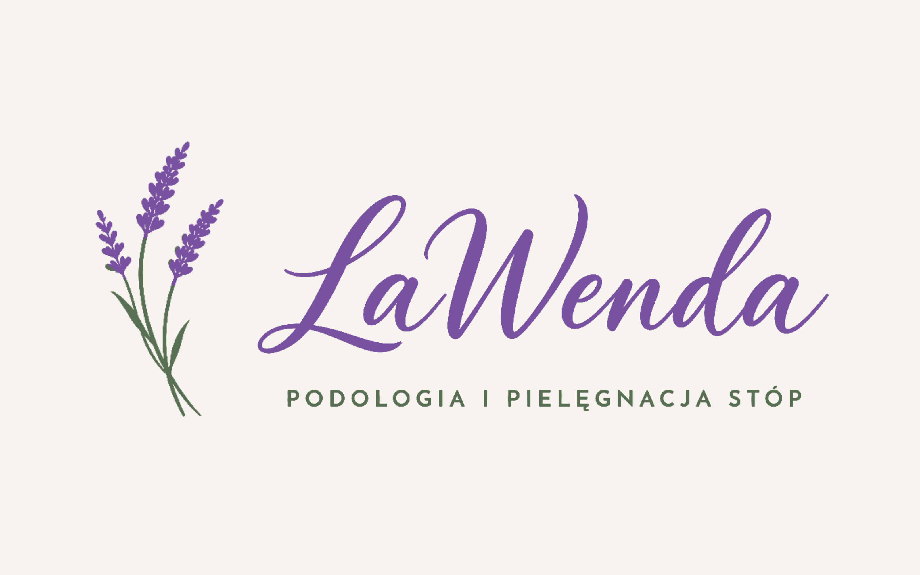 B
Direction 03
Expressive calligraphy
Flowing loops, an expressive swash and three lavender sprigs.
Explore direction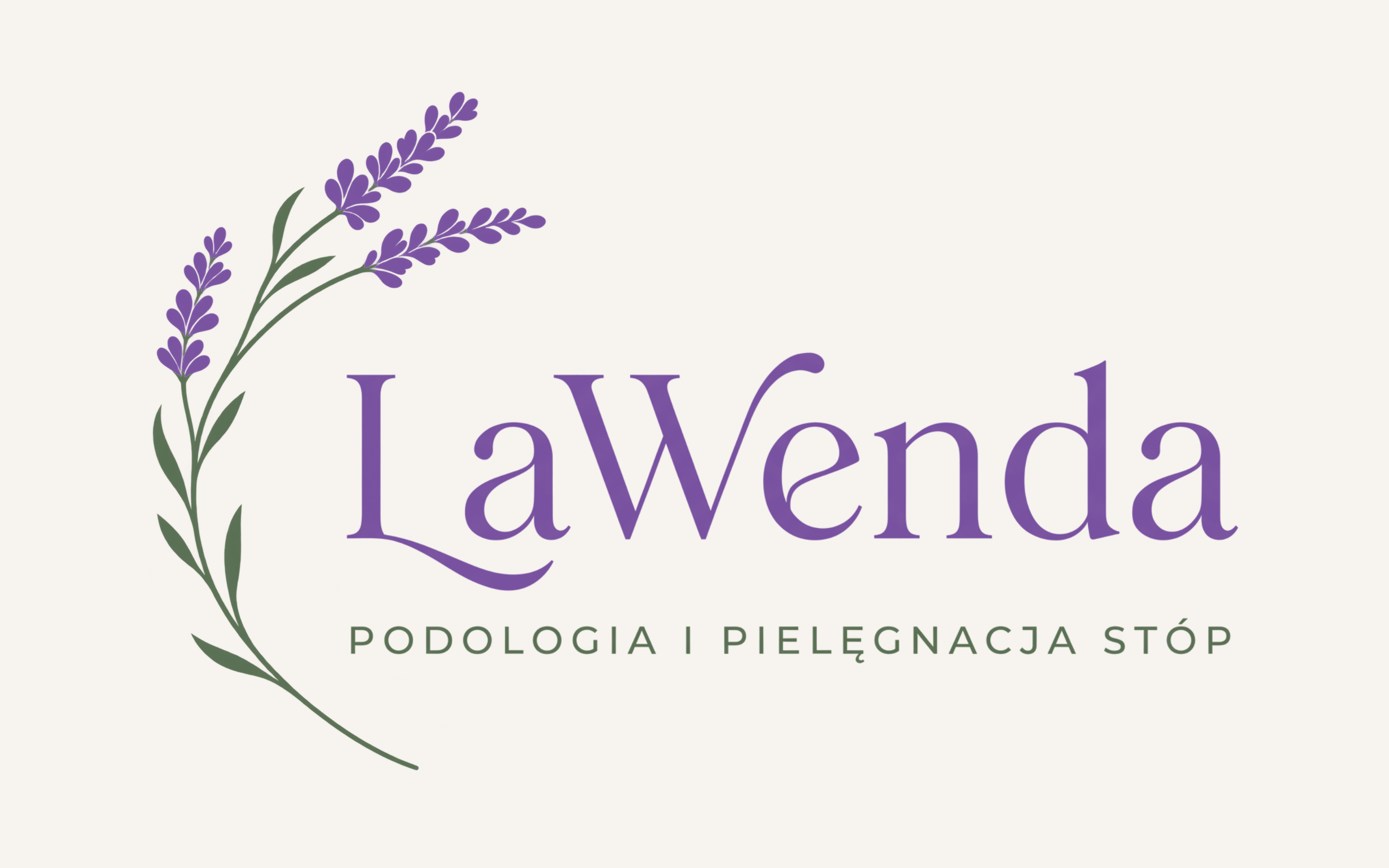 04
Direction 04
Lavender arc
Three lavender spikes, an open arc and serif lettering with distinctive swashes.
Explore direction