

SATO · Sushi & Blumen
A house, good taste and a blossom. Two identity directions for a sushi bar bringing Japanese food and flowers together.
 Sushi & Blumen / Identity study
Task
Rework the existing house motif, introduce a restrained floral element and explore the identity across physical touchpoints.
Our role
Logo concepts, visual identity, application mockups and interactive presentation.
Solution
Two logo concepts, colour variations and a presentation system for packaging, bags, cards and signage.
One house. Two expressions.
The first direction uses an expressive roofline, an open window and a blossom. The second brings the house and flower into quieter geometry. Both connect food and floristry without a literal sushi illustration.
A consistent signature.
Colour, monochrome and reversed artwork keep the composition consistent across paper, dark surfaces and small applications.


From an idea to everyday objects.
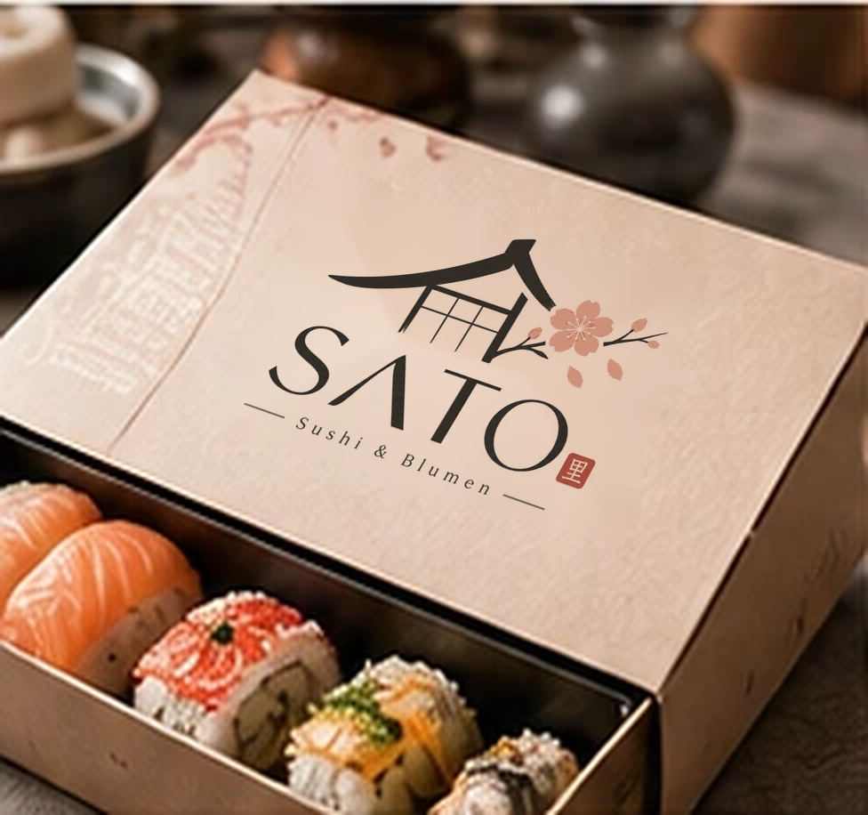
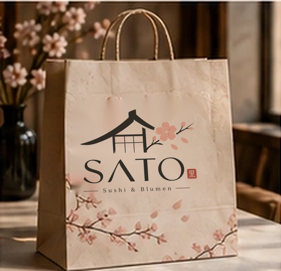
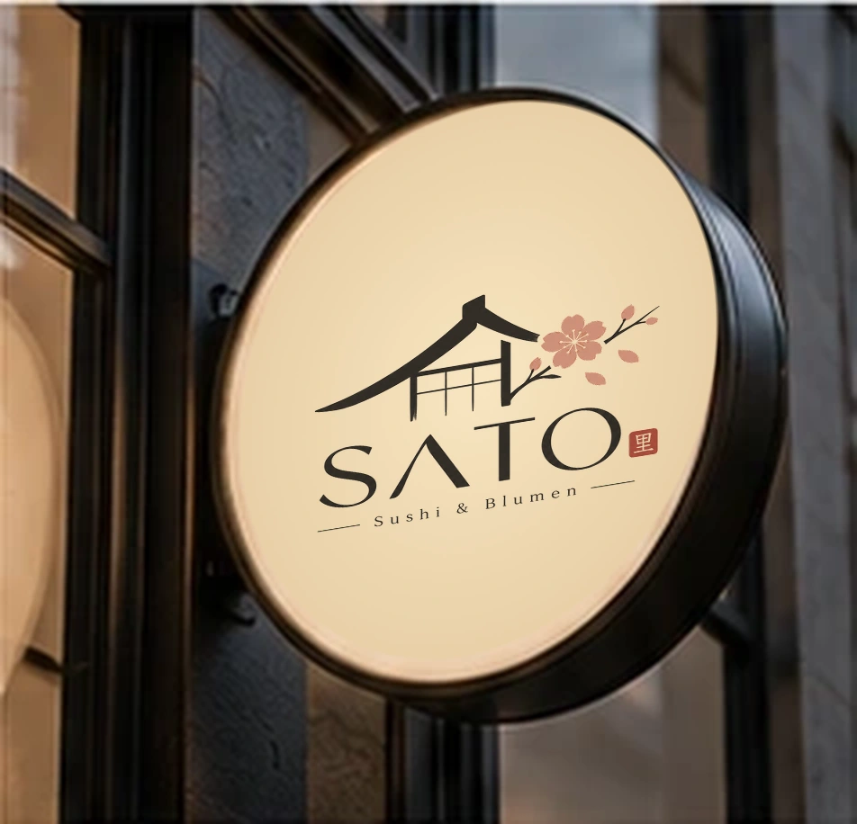
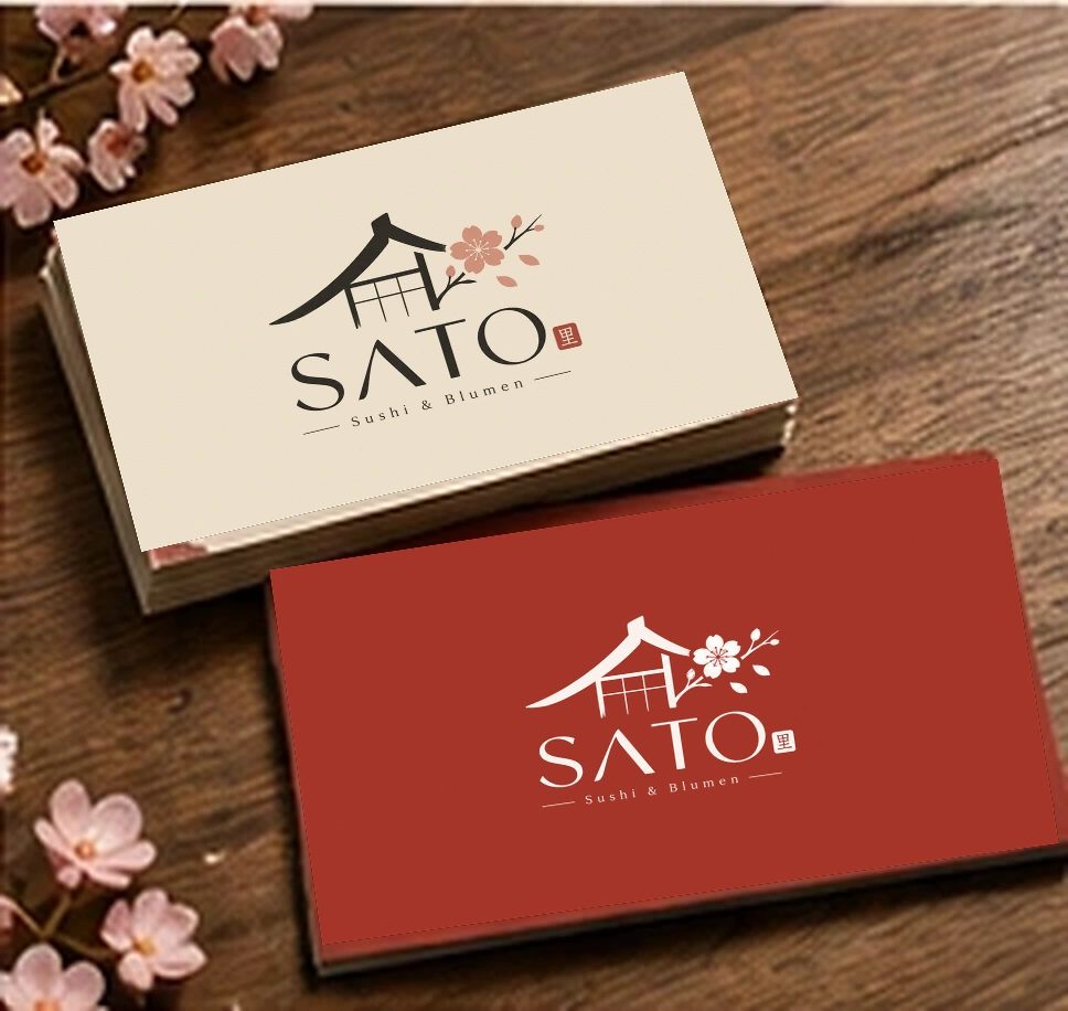
Four touchpoints explore the character of the identity. Kraft packaging feels warm, a red card reverse adds contrast and a round sign keeps the house silhouette readable.
Colour, typography and details.
Ink and warm paper form the base. Blossom and clay add softness; a red seal provides a precise accent. Cormorant Garamond and Manrope are proposed for supporting communication, not as substitutes for the logo lettering.
Ink
#2B2823
Blossom
#CE9684
Ivory
#F5E8D8
Clay
#AD503E
Vivid red
#E4342A
Good taste.
Beautiful moments.
Aa Бб 0123
Manrope / Body & InterfaceNeed something similar?
Share the niche, goal and materials you already have. We will return with a clear launch plan.